In my humble opinion… This design takes a bit of a detour from the usual direction of my drawings. This design… Well, it kinda speaks for itself doesn’t it?
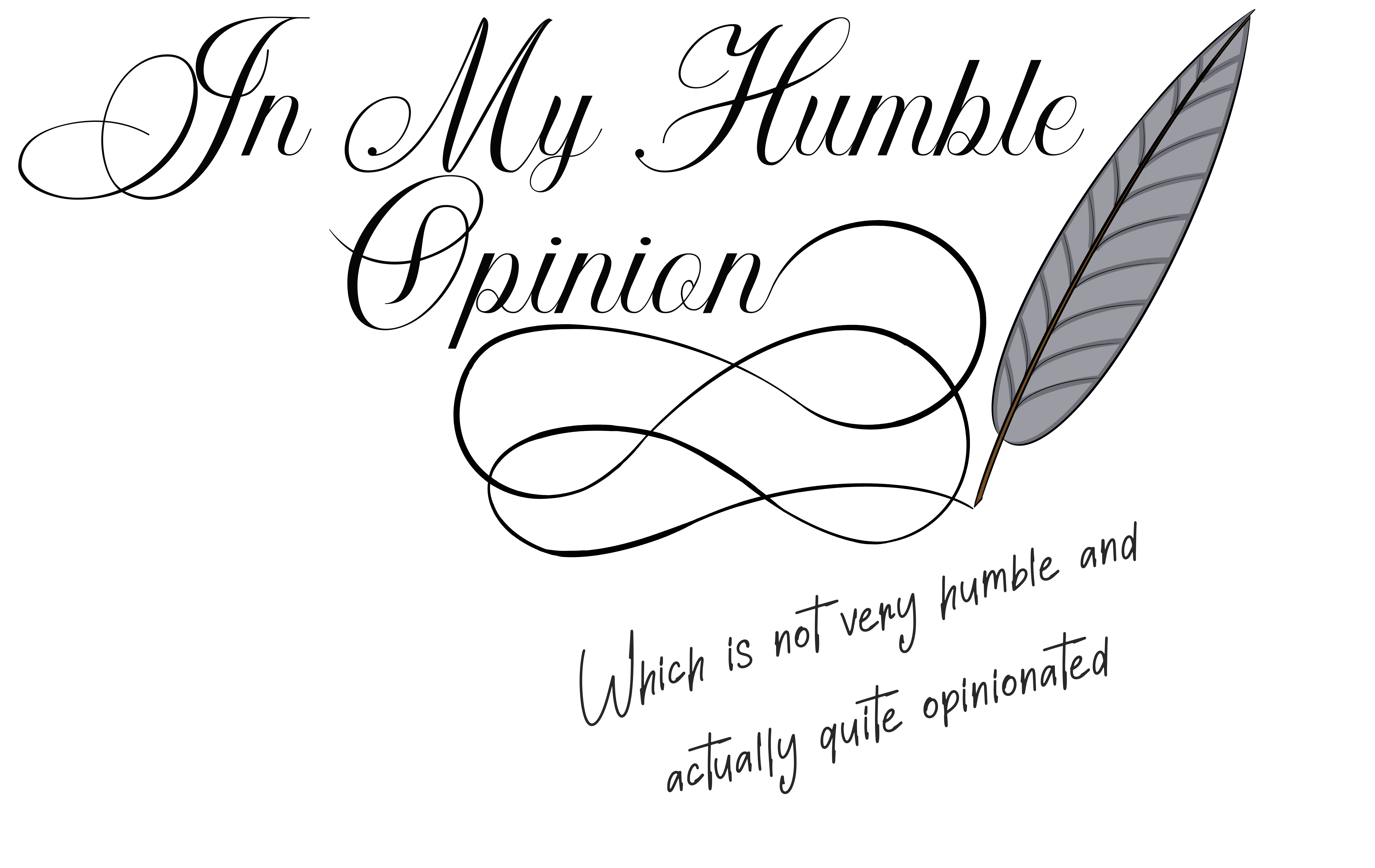
If you have spent much time around me in person, you have heard me say these exact words… Probably on more than one occasion. In fact I have heard more than once that I should make this into a tee-shirt since “In my humble opinion, which is not very humble and actually quite opinionated” is probably my catch-phrase.
Why do I say this? Because it’s true. And I often find that when people say “in my humble opinion” they actually mean that what they are about to say is not very humble and actually quite opinionated. So when I know that what I am about to say is kinda prideful and not really based on substantiated fact, I call it like it is. And I find that it actually often opens the door to deeper discussion and greater understanding and I often come out of the conversation with a greater sense of humility and feeling like I have learned something.
Plus, it sometimes gets a laugh and I live to hear others laugh.
In My Humble Opinion Design Process
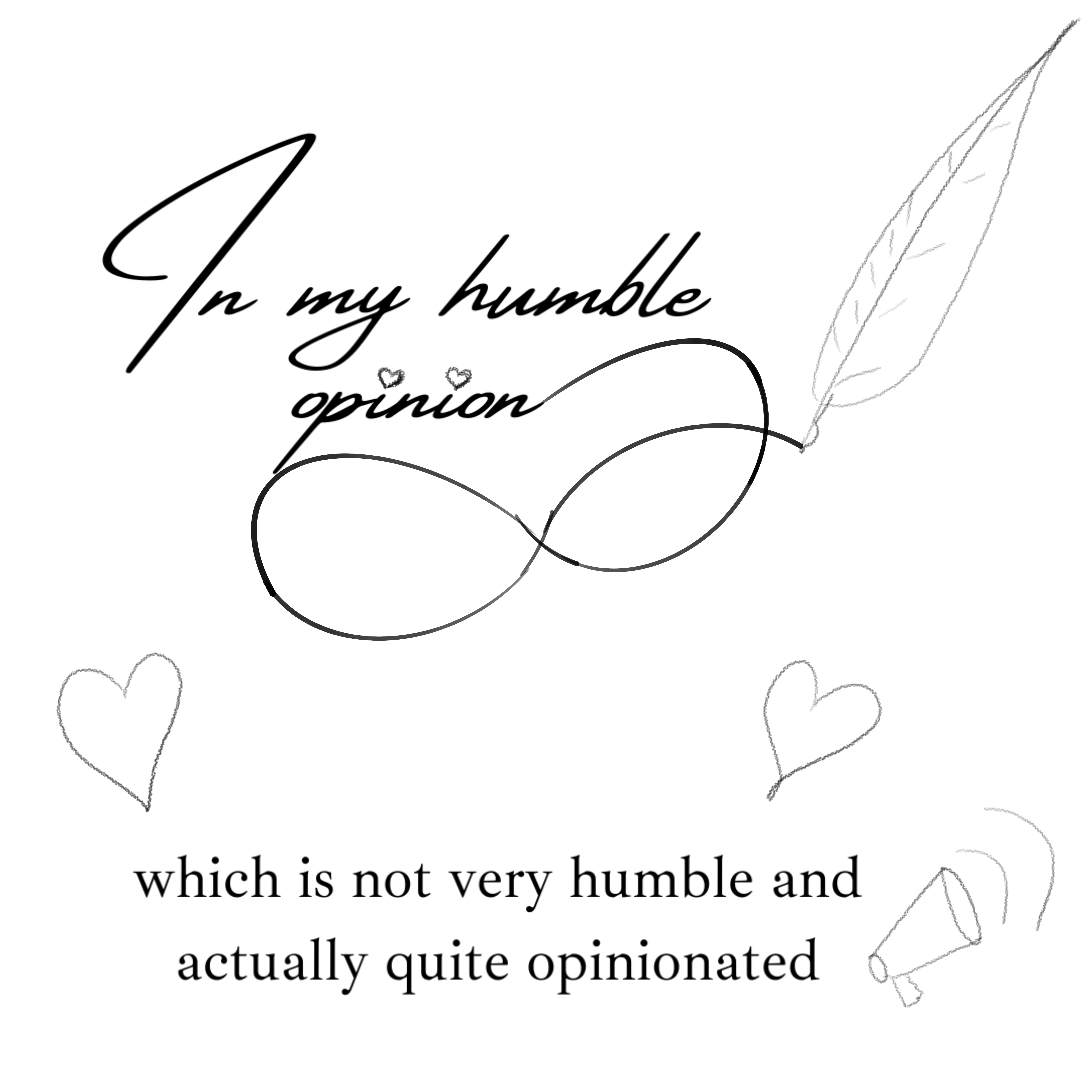
I’m not much for typography. I knew that this particular design would rely heavily on the text and I really tried in my mock-up to give as much space as possible to my drawings because that’s really what I bring to the table.
As you have probably noticed, the final version is much more about the words and less about filling the space with my doodles. I did draw up good copy versions of all of the quick scribble elements from the mock-up.
Malcolm and I spent a good while looking for the right calligraphy that would work well with the filigree that I had created with a similar weight and flow and that could attach properly at the ‘n’ on opinion. In retrospect, it might have been easier to finalize the font and then create the filigree to match. But we didn’t do that.
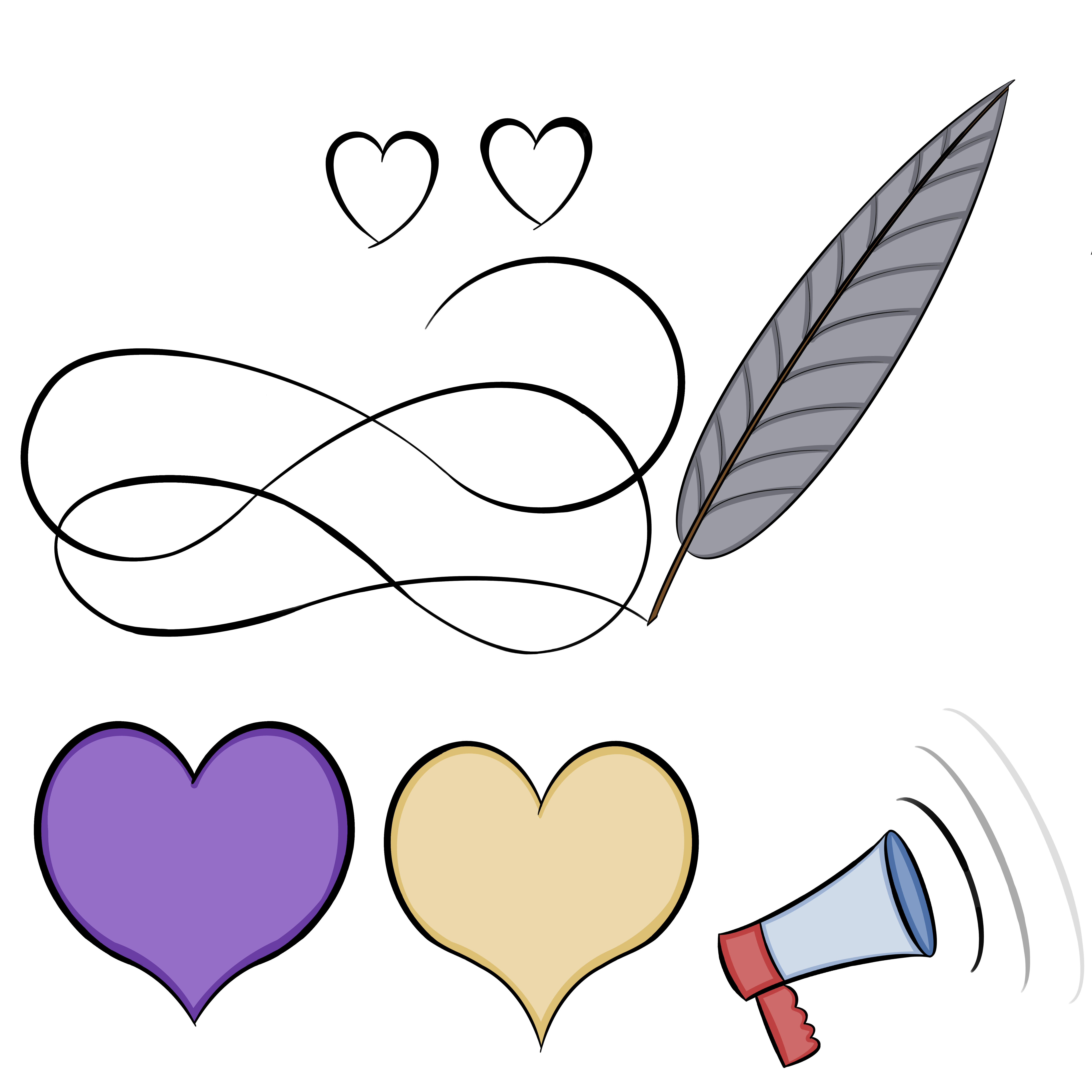
We tried to put all the elements in, but it quickly became clear that the image became too cluttered and busy. It was better to scale back to just the essential pieces… The words, the filigree and the feathered quill. I guess this design process in and of itself was a lesson in humility for me.
Sometimes simpler is better and it’s about finding a balance in what we bring to the table to create the best finished product. So I didn’t fight too hard to keep any of the elements that didn’t make the final cut.
In My Humble Opinion Products
Light design on dark background:
- In My Humble Opinion… Unisex tee
- In My Humble Opinion… Women’s Tee
- In My Humble Opinion… Men’s tee
- In My Humble Opinion… Unisex Hoodie
- In My Humble Opinion… Women’s Cropped Sweatshirt
Dark design on light background: