We have all heard the old axiom that it takes a village to raise a child. There is another side to that statement, another truth that infertiles know very well… Sometimes it takes a village to make a child! That village can look like doctors and nurses and ultrasound techs and phlebotomists and others in the medical field. It also includes a support system of other infertiles who understand the ins and outs, and highs and lows, of this tumultuous journey. Supportive family and friends who make space for us in our grief, in our hope and in our waiting are a super important part of the journey too. This village may also include lawyers, social workers, mental health practitioners, birth families, donors, and/or surrogates.
Historically, we’ve been told to keep the struggle private, to not let others know that what comes easy to most is next to impossible for us, but over the past few years more and more people have been willing to share and to reach out for communities of compassion and understanding. Our villages have expanded to include each other.
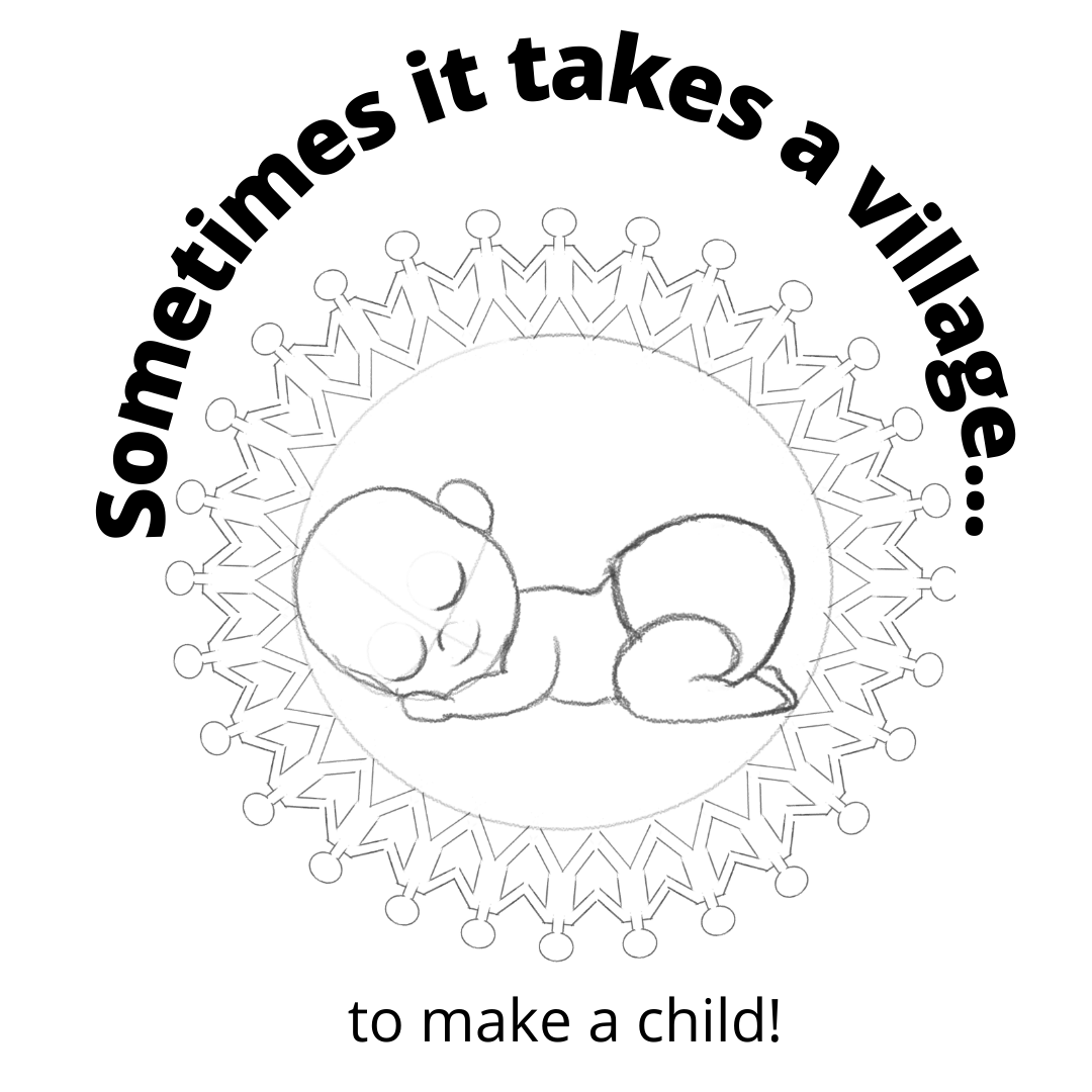
I created this image to celebrate the village that forms around us in help and support as we try to grow our families.
When you make a purchase of this or any other design on ThreadHunters you become an important piece of our village. I personally thank you so much for that.
Sometimes it Takes a Village Design Process
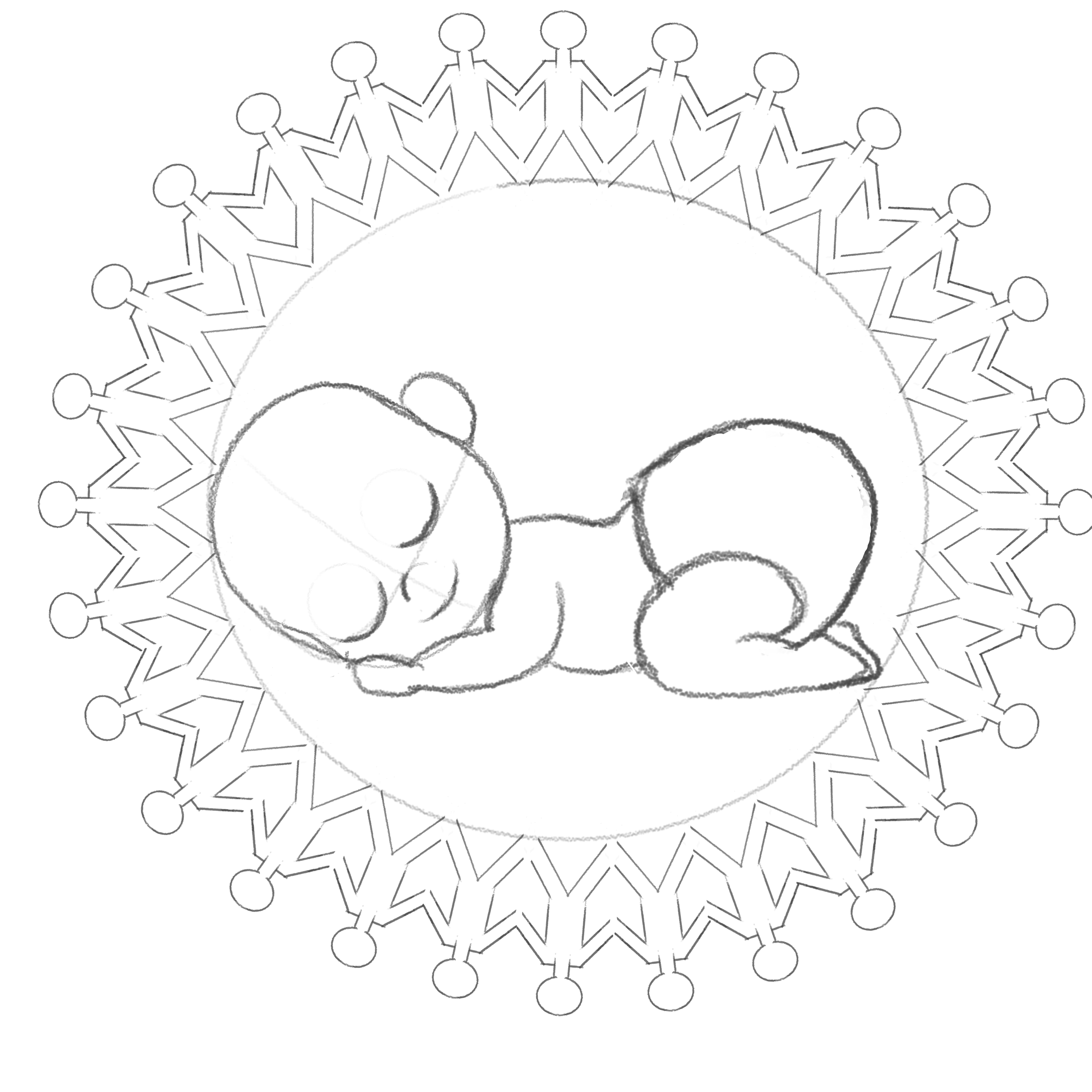
I had a pretty clear image in mind when I started my doodle for this design. I really spent a lot of time trying to draw a “cute” baby. I had several tries that were not cute and I erased them without saving! Gotta love the undo button! When I got the face right I felt like the rest would fall into place…
Well the stick people proved to be a bit more of a challenge. I used the copy function and tried to fit them nicely in a circle around the baby. The idea is that they would look like paper cutout people. They didn’t line up very easily and not all of them were holding hands, some legs were longer than others and some were shorter. I showed the first attempt to my hubby and he said, “Why are they all men?” I responded “they could be women… women wear pants!” But his comment stuck with me and I didn’t want other people wondering why they were all men and… yeah… stick people women wear skirts… So I added skirts.
I wanted the people to be symmetrical and I went back to the drawing board to measure out a circle and divide it into even portions and use the symmetry line in the app to make everything perfectly symmetrical… With skirts on every other person to satisfy the hubs. I was about half way around the circle when I showed it to my brother in law (who is very artistic) he told me he preferred the imperfection of the original “paper” people. I whimpered a bit about how much time I had sunk into the perfect people, but after flipping back and forth between the two circles, I started to agree with my brother in law, the little imperfections in the sketched ones really gave it that organic, hand made… Something. I trashed the “perfect” people and I don’t have an image of them to show here.
I did tidy up the original sketch of the people a bit and put skirts on half of them. I also attempted to make their orientation a bit more circular since I knew I wanted the words to go around them and that would only serve to draw attention to how not circular they were.
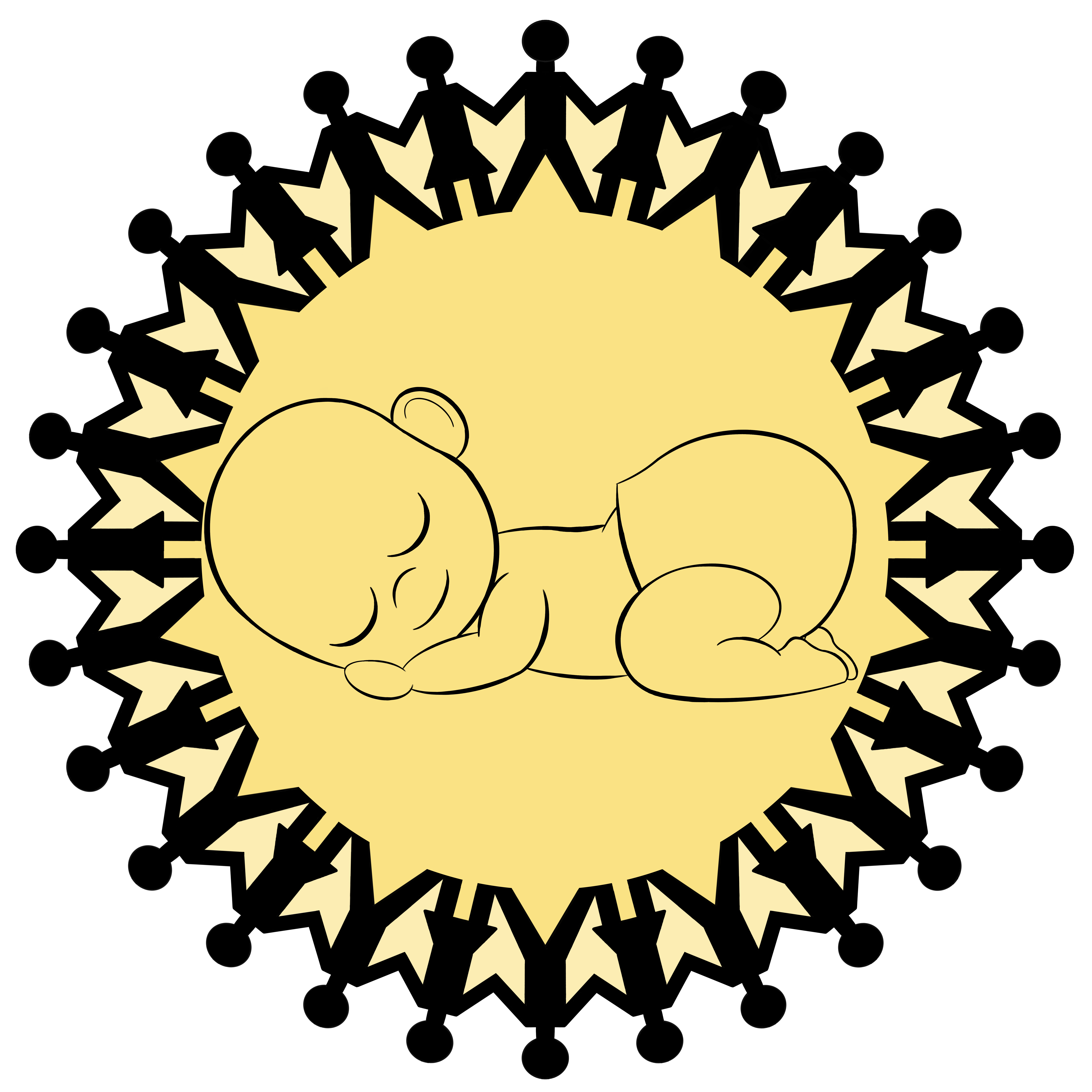
I played around with colour. I decided it was best to not colour in the baby, but I did want a pop of colour. Pink and blue were both out and I wanted it to be softer and happier than red. I tried green but that wasn’t right. Orange and purple were not right either. I chose a warm yellow and it felt right. I decided to go a tone lighter for the spaces between the people, kinda embracing the mandala type effect that they created. I tried alternating shades, thinking it would look a bit like rays of sunshine, but it just looked weird so I went back to just one solid hue. I still think that the two tones of yellow have a bit of a sunshine feel to them.
I am willing to release a version of this design without colour, just black and white, if there is a demand for it… But I personally love the yellow. I’m also willing to release it without the words if people would rather that. What do you think?
Sometimes it Takes a Village Products
- Sometimes it Takes a Village Unisex tee
- Sometimes it Takes a Village Unisex tee – small design
- Sometimes it Takes a Village Men’s tee
- Sometimes it Takes a Village Men’s tee – small design
- Sometimes it Takes a Village Women’s tee
- Sometimes it Takes a Village Women’s tee – small design
- Sometimes it Takes a Village Unisex Hoodie – back design
- Sometimes it Takes a Village Unisex Hoodie – small design
- Sometimes it Takes a Village Women’s Cropped Sweatshirt – back design
- Sometimes it Takes a Village Women’s Cropped Sweatshirt – small design
- Sometimes it Takes a Village Baby Onesie
- Sometimes it Takes a Village Baby Tee
- Sometimes it Takes a Village Toddler Tee
- Sometimes it Takes a Village Stickers